
So you're staring at a blank resume template again, and somehow it still feels confusing. I get it. There are literally hundreds of resume designs floating around online right now, and half of them look like they were made for a graphic designer's portfolio, not for someone applying to an actual job. Some have sidebars, some have circular skill meters, some have photos and colored headers that take up a third of the page. And then there's the plain kind — just black text, a name at the top, a few clean sections, nothing flashy. People often assume the fancier one wins. In real hiring situations, that's usually not true.
Before picking a template, it actually helps to step back and understand that resumes aren't just "designs." They fall into a few real categories, and each one is built around a different hiring situation. Once you know which bucket you're in, choosing a layout becomes a lot less stressful.
The Four Resume Types Nobody Really Explains Properly
Most career sites throw templates at you without explaining why they exist. Here's the short version, without the jargon.
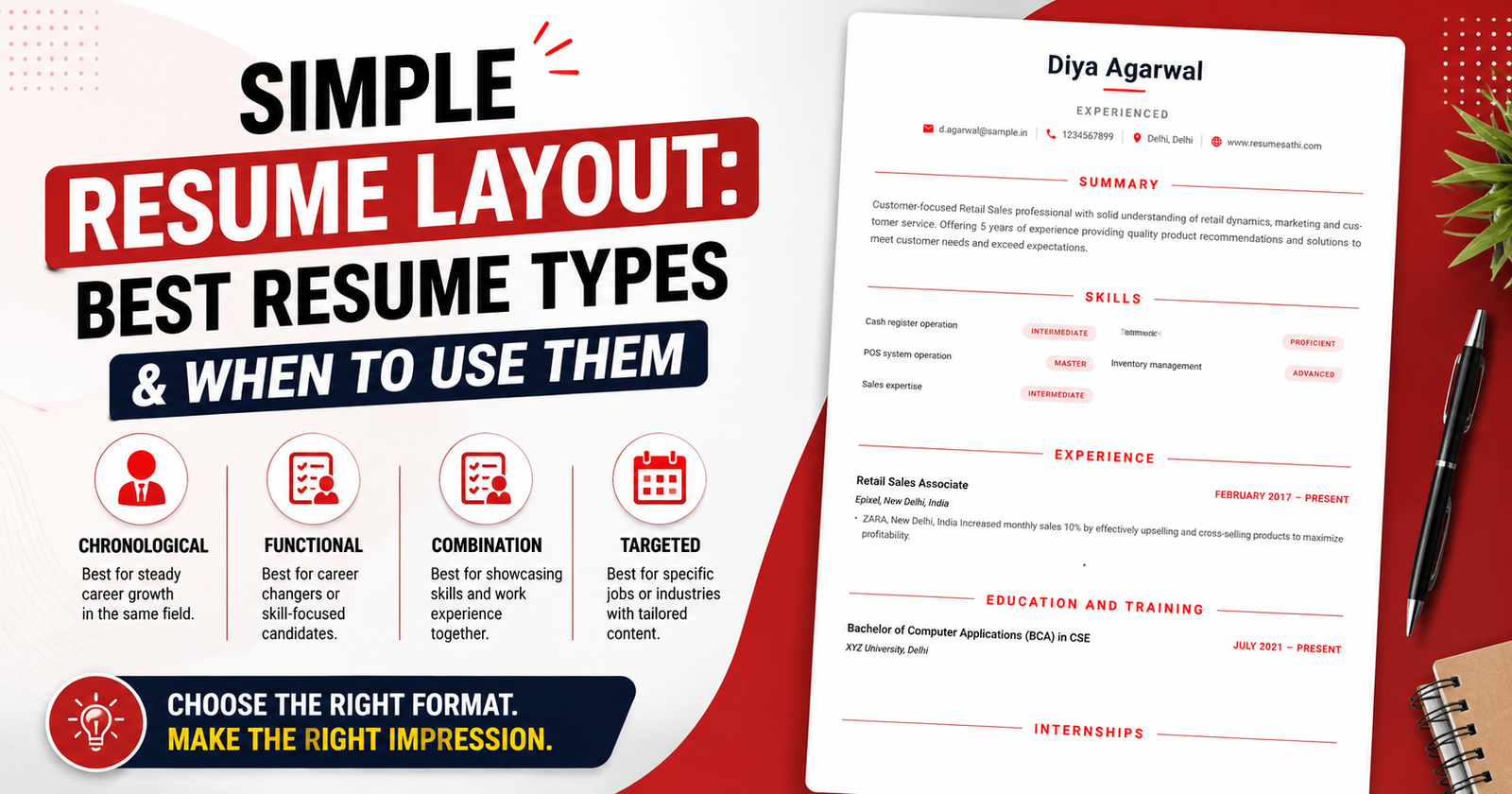
- Chronological Resume — This is the old faithful. Work history listed newest to oldest. Recruiters are trained to scan this format fast because it's what they've seen a thousand times. If your career has been fairly linear, this is almost always the safest bet.
- Functional Resume — Built around skills instead of a strict timeline. Good if you've had gaps, took a break, or you're switching into a completely different field and don't want your past job titles to be the first thing someone judges you on.
- Combination Resume — A blend of both. You get a skills section up top and then a chronological work history below it. This tends to suit people with a handful of years of experience who want to highlight both.
- Creative or Visual Resume — Heavy on design, color, icons, sometimes even illustrations. Common in design, advertising, or media roles where the resume itself is expected to show off some visual sense.
None of these is "the best" one objectively. It really depends on what job you're applying for and who's going to be reading it — a human, a hiring software, or both.
Where a Plain, No-Nonsense Layout Actually Fits
Now, the layout style we're talking about here — bold name up top, one horizontal line for email, phone, city, and website, then clean sections for Summary, Skills, Experience, and Education stacked one after another — this is basically a stripped-down chronological resume. No sidebars. No color blocks fighting for attention. No decorative graphics pretending to be relevant. Just information, laid out in the order someone would naturally want to read it.
There's a reason this style keeps showing up again and again, even though it looks "boring" compared to some templates. A huge number of companies now run resumes through Applicant Tracking Systems before a human even glances at them. These systems are notoriously bad at reading resumes with tables, multiple columns, or graphics — sometimes they scramble the text order completely or skip sections entirely. A single-column, text-first resume almost never has that problem. It just gets read the way it's meant to be read.
So while a creative resume might turn heads visually, a simple layout like this one is often the one that actually survives the first digital filter and lands in front of an actual person, which honestly matters a lot more than how it looks on a screen.
Who This Layout Actually Makes Sense For
This kind of clean, no-frills format tends to work particularly well for:
- Retail, sales, and customer-facing roles, where clarity and quick scanning matter more than visual impression
- Cashier, POS operator, and front-desk type positions
- Fresh graduates or first-time job seekers who don't have a long history to fill up space with anyway
- Operational roles — warehouse, inventory, logistics assistant positions
- Any application submitted online through a company portal, since most of those run ATS scanning
- People switching careers who still want something that reads clean and doesn't distract from the actual content
On the flip side, if you're applying somewhere design-heavy — say, a branding studio, a UI/UX role, or something in the creative arts — a plain layout might actually undersell you a little. In those fields, a bit of visual flair is almost part of the job requirement, since the resume is a small sample of your design sense. But for retail, sales, admin, operations, and most entry-level corporate jobs, keeping it simple usually works in your favor rather than against it.
Small Details That Make This Kind of Layout Work
What's interesting is that even a "simple" resume has small design decisions baked into it that make it easier to read. A few worth noticing:
- The name is large and bold, so it's the very first thing anyone's eyes land on — which is exactly how it should be.
- Contact details are squeezed into one single line instead of stacking on separate lines, which saves vertical space that can be used elsewhere.
- Section headers are separated with a thin horizontal rule rather than a colored background, which keeps things visually calm without wasting ink or looking cluttered.
- Skill levels are shown with small tags like Intermediate, Advanced, or Master instead of long-winded explanations, so a recruiter gets the picture in half a second.
- Each section has a clear beginning and end, so someone skimming for ten seconds — which is genuinely how long most resumes get looked at — can still find what they need without hunting for it.
None of these choices are accidental, even though the layout looks effortless. Good simple design usually takes more thought than a busy one — it's the difference between removing everything unnecessary and never thinking about what was necessary in the first place.
Why People Still Underestimate Simple Resumes
There's a weird bias people carry when they're job hunting — they think a resume needs to "look impressive" the way a poster or an invitation card does. But a resume isn't marketing material in that sense. It's closer to a form that needs to be filled out clearly so a stranger, who has thirty other resumes to get through that same hour, can quickly figure out whether you're worth calling. Every unnecessary design element is basically friction. It slows the reader down, even by a second or two, and in a stack of applications, seconds matter more than people realize.
This doesn't mean every resume should look identical or lifeless. A little personality in the wording, a well-chosen accent color, a clean font — all of that is fine and can still make a resume feel put-together. The line is between "designed with intent" and "designed to look busy." The layout we've been talking about sits comfortably on the right side of that line.
A Small Reality Check
Here's the thing nobody likes to hear: the layout is just the container. It genuinely does not matter how clean, minimal, or well-organized a resume looks if the content inside it is vague, exaggerated, or copied word-for-word from a template example. Recruiters read hundreds of resumes and they can tell within seconds when something feels generic. Numbers should be real. Skills should reflect what you can actually do. Job descriptions should sound like they came from your own experience, not from a list of buzzwords someone else wrote.
A well-structured layout can absolutely help someone get noticed faster and get past automated filters. But at the end of the day, it's the honesty and specificity of what's written inside that gets someone an interview call. The format just makes sure that message actually reaches someone in the first place, instead of getting lost or misread before it ever gets a fair chance.

Comments
No comments yet. Be the first to comment.