
Most people pick a resume template the way they pick a shirt online. They scroll, see something that looks good, and click. An hour later they are fighting with it. The sidebar is too narrow for their job titles. The photo box leaves a hole in the page because they have no photo. The skills section has room for five items and they have twelve.
A template is only a container. It decides where things go, how big the headings are and how much space each part gets. It does not decide what a recruiter thinks of you, and no template turns a weak resume into a strong one. But a bad match between template and person causes real trouble: text that gets cut off, a second page with three lines on it, or a file that scanning software reads in the wrong order.
This guide is about getting that match right. It covers what to look for in a template, the main layout types, how applicant tracking software (ATS) deals with them, and how to fill one in so it actually works. Eight free templates from ResumeSathi are shown with screenshots, and each one is described plainly, including the places where it falls short. By the end you should be able to open a template from any site and judge it in about a minute.
Create Free ATS Friendly Resume Now : Click Here
Quick answer: which template should you start with?
If you only want a starting point, use this table. The reasons behind each pick are explained in the rest of the post.
| If you are | Start with | Why |
|---|---|---|
| A fresher or recent graduate | Template 1 or Template 5 | Education, projects and internships sit high on the page, and nothing needs a long job history to look full |
| Applying to big companies through online portals | Template 1 or Template 4 | Single column, normal headings, plain text. Least likely to confuse software |
| Experienced, with several jobs to list | Template 4 or Template 6 | Wide text area and clear date alignment, so longer job descriptions stay readable |
| Applying in marketing, design or a creative field | Template 7 or Template 2 | More visual structure, room for social links and a portfolio |
| A developer or engineer | Template 8 or Template 5 | Compact, with a tag-style skills block that suits a tech stack |
| Applying where a photo is expected | Template 2, 3 or 6 | These have a photo area. Check the notes on photos before using one |
| Applying to banks, government or old-style companies | Template 4 | Plain, formal, no photo, no icons |
- What a resume template does and does not do
- How to judge a template in one minute
- The main layout types
- The 8 templates, one by one
- Templates and ATS: what is true and what is exaggerated
- Fonts, colours, photos, icons and skill bars
- How to fill in any template
- One template, many jobs
- Template mistakes people keep making
- Checklist before you download
- Frequently asked questions
What a resume template does and does not do
A resume template is a pre-made layout. You type your details into the boxes and the tool handles fonts, spacing, alignment and the PDF. That saves a lot of time. If you have ever tried to line up dates on the right side of a Word document using the space bar, you know why.
What a template cannot do is write for you. The summary, the bullet points, the choice of what to leave out, all of that is still your job. It is also worth being clear about what a template cannot fix. If your bullet points say "responsible for sales" and nothing else, a beautiful layout will just make that sentence look nicer. The recruiter still reads the same weak line.
There is one more thing people tend to forget. A template makes decisions for you, and those decisions have costs. A template with a big photo area costs you space. A template with a narrow sidebar forces your skills to be short. A template with skill bars asks you to rate yourself, and those ratings are hard to defend in an interview. None of these are wrong choices. They just need to match your situation, which is why picking carefully is worth ten minutes.
If you are still working on the writing itself, two earlier posts on this site cover that in more detail: one on rewriting a resume with before and after examples, and one on the best resume format for different jobs. This post stays on the template side.
How to judge a template in one minute
Before you fall for the colours, run five quick checks. They take less time than reading this paragraph twice, and they catch most of the problems people find only after they have typed everything in.
1. The squint test
Open the template preview and lean back, or squint until the text goes blurry. What stands out? It should be your name, then your job titles, then the section headings. If the eye lands on a photo, a coloured bar or an icon first, the design is competing with your content.
This matters because the first look is short. An eye-tracking study by the job site TheLadders, first published in 2012 with 30 recruiters and repeated in 2018, found that recruiters spent only around six to seven seconds on their first pass through a resume. Most of that time went to a handful of things: the name, the current and previous job titles and companies, the dates, and education. The study was small and measured only the first glance, so it does not mean your resume is read in six seconds from top to bottom. It does tell you which parts of the page have to be easy to find. A good template makes those parts obvious without any effort from the reader.
2. The plain text test
Download the sample PDF, open it, select everything and paste it into Notepad or any plain text editor. Read what comes out. Is your name first? Are the jobs in a sensible order, with titles next to the right dates? Or do you get your skills list in the middle of your work history?
This is a rough way to see what scanning software sees. If the text comes out clean and in order, that is a good sign. If it comes out jumbled, or if some text is missing, the template is hiding information from software that reads files without looking at them. We will come back to this test in the ATS section, because it is the single most useful thing you can do yourself.
3. The your-content test
Sample text in a template is always short and tidy. Your real content will not be. Before you commit, paste in your longest job title, your longest company name and your most detailed job description. See what happens. Does the job title wrap onto a second line and collide with the date? Does a long company name get squeezed? Does the page flow onto a second sheet when you add the fifth job?
This is where narrow sidebars usually fail. A sidebar of about a third of the page width is fine for "Python" and "Excel", but not for "Customer Relationship Management (CRM) Software". If your skills have long names, you want a layout with a wide skills area.
4. The black and white test
Print the sample in black and white, or just view it in greyscale. Plenty of people print resumes on office printers, and plenty of recruiters print them for interview panels. A template with a solid dark header or a full-height coloured sidebar can come out as a heavy grey block, with the white text inside it hard to read. A template that uses colour only for headings and thin lines will survive printing without any change.
This is not a reason to avoid colour. It is a reason to check the greyscale preview and make sure the text is still readable. If you know your resume will mostly be read on a screen, you can relax about it.
5. The edit test
Try removing a section. Delete Hobbies, or Internships, or Social Links. Does the layout close up neatly, or does it leave a gap? Try adding a section you need, like Projects or Certifications. Can you do it? A template you cannot adjust is a template you will end up fighting with every time you apply for a different job, and you will be applying for more than one.
Resume builders differ a lot here. Some let you turn sections on and off and reorder them. Some give you a fixed set. Know which kind you are using before you start.
The main layout types
Almost every template you will see is one of a few basic layouts. Knowing them makes the choice faster, because you stop comparing hundreds of designs and start comparing five or six shapes.
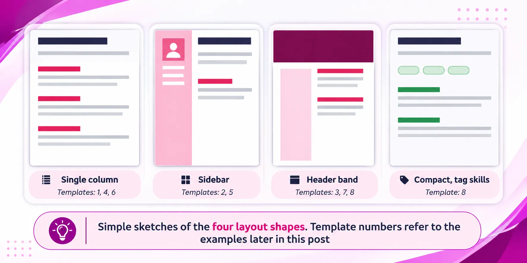
Single column
Everything runs from top to bottom in one stream: header, summary, experience, education, skills. It is the oldest layout and still the most common one in hiring. Its strength is that there is only one way to read it. Software reads it in order, people read it in order, and printing is simple.
The weakness is that it can look plain, and it uses space less efficiently. Skills and languages take up full-width lines even though they are short. If you have a long work history, a single column handles it best, because job descriptions get the whole width of the page.
Sidebar (two columns)
A narrow column on one side holds contact details, skills, languages and similar short items. A wide column holds the summary and the work history. It makes good use of space and looks more designed, which is why it is popular.
The sidebar is the risk. Everything in it has to fit a narrow width, and in some tools the text in the sidebar and the text in the main column are stored in a way that confuses software. Whether that is a real problem depends on the template and on the system reading it, and we go through the evidence honestly in the ATS section. For now, treat a sidebar layout as a good choice for direct applications, emails and networking, and a choice to test first for portal uploads.
Header band
A coloured band at the top holds the name, job title and contact details, sometimes with a photo. Below it, the page is either one column or two. The band gives the page a strong first impression and clearly separates identity from content.
The costs are the ones from the black and white test. A dark band uses a lot of ink and can look heavy on paper. It also takes up vertical space, so you have less room for content on a one-page resume. Used well, it is a good fit for people who want a modern look and mostly share their resume as a PDF on screen.
Compact with tag-style skills
Short, dense and tidy. Skills appear as small tags or pills, and each job takes only a few lines. This works well for technical roles where the skills list is the first thing the reader wants. It works less well for roles where your experience needs room to explain, because the compact format pushes you to be brief.
Whichever shape you pick, remember that the shape is a tool and not a goal. The next section shows eight real templates in these shapes, so you can see how the differences look on an actual page.
The 8 templates, one by one
The eight examples below are free templates from ResumeSathi. The first four show the same sample person in four different designs, which makes it easy to see how much of the difference is layout and how much is content. The other four use different sample people and roles. For each one you will find what the layout looks like, who it suits, what to watch out for, and one practical tip for filling it in.
A note on the sample text. All names, companies and contact details in these screenshots are made up, as they are in any template preview. Replace everything, and read the sample bullets as examples of format, not as wording to copy.
Template 1: single column with a centered header
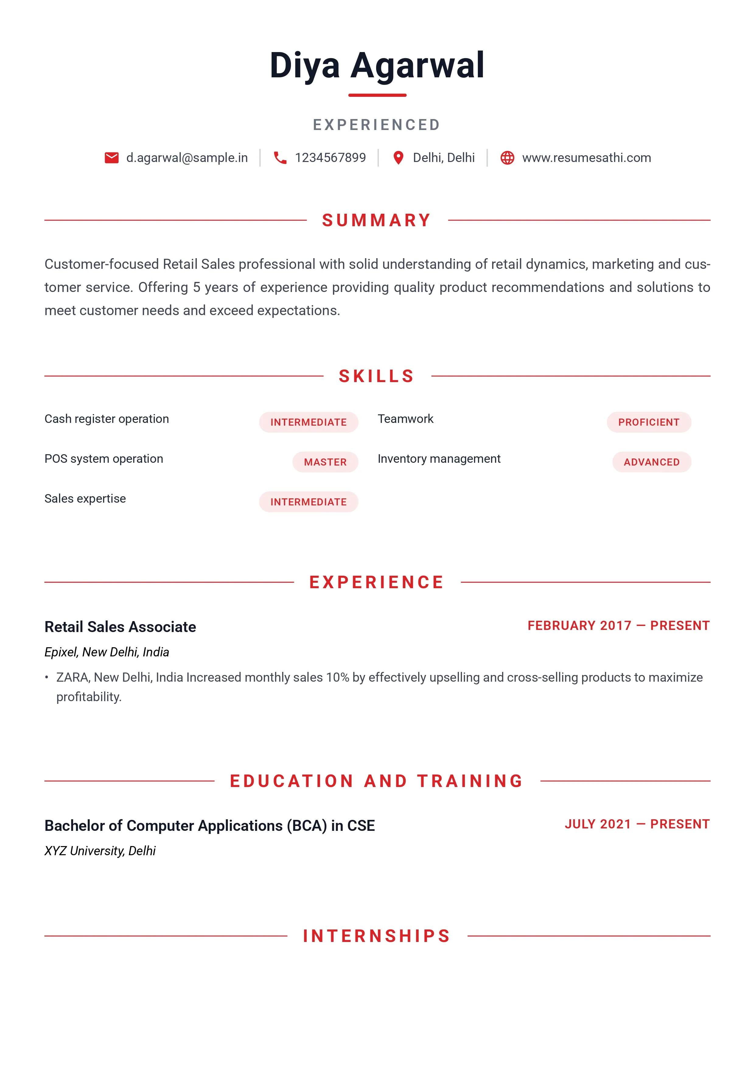
What it looks like. The name sits in the middle at the top with a short red line under it. A grey label below it says the person's level, and one line of contact details follows, each with a small icon. Section headings are red capitals centered between two thin lines. Skills are shown in two columns, each with a small rounded tag that names the level, such as Intermediate or Advanced. There is no photo.
Who it suits. This is a good all-round template, and a safe first choice for freshers and for people applying through company portals. It reads in one direction, the headings are standard, and the page has plenty of white space. The sections it comes with are Summary, Skills, Experience, Education and Training, and Internships, which covers what most early-career people need.
Watch out for. Two things. First, the level tags next to each skill. They look neat, but they take up room and they invite questions. If you tag something Advanced, an interviewer may test you on it. Use them only for skills where the level really helps the reader, like a language, and otherwise drop them. Second, empty sections. The preview shows an Internships heading with nothing under it. If you have no internship, delete the section, because an empty heading looks like an unfinished form.
Tip for filling it in. Keep the summary to three lines. The centered layout leaves wide margins, so a long paragraph looks heavier here than it would in a template with tighter edges.
Template 2: dark header band, sidebar and photo
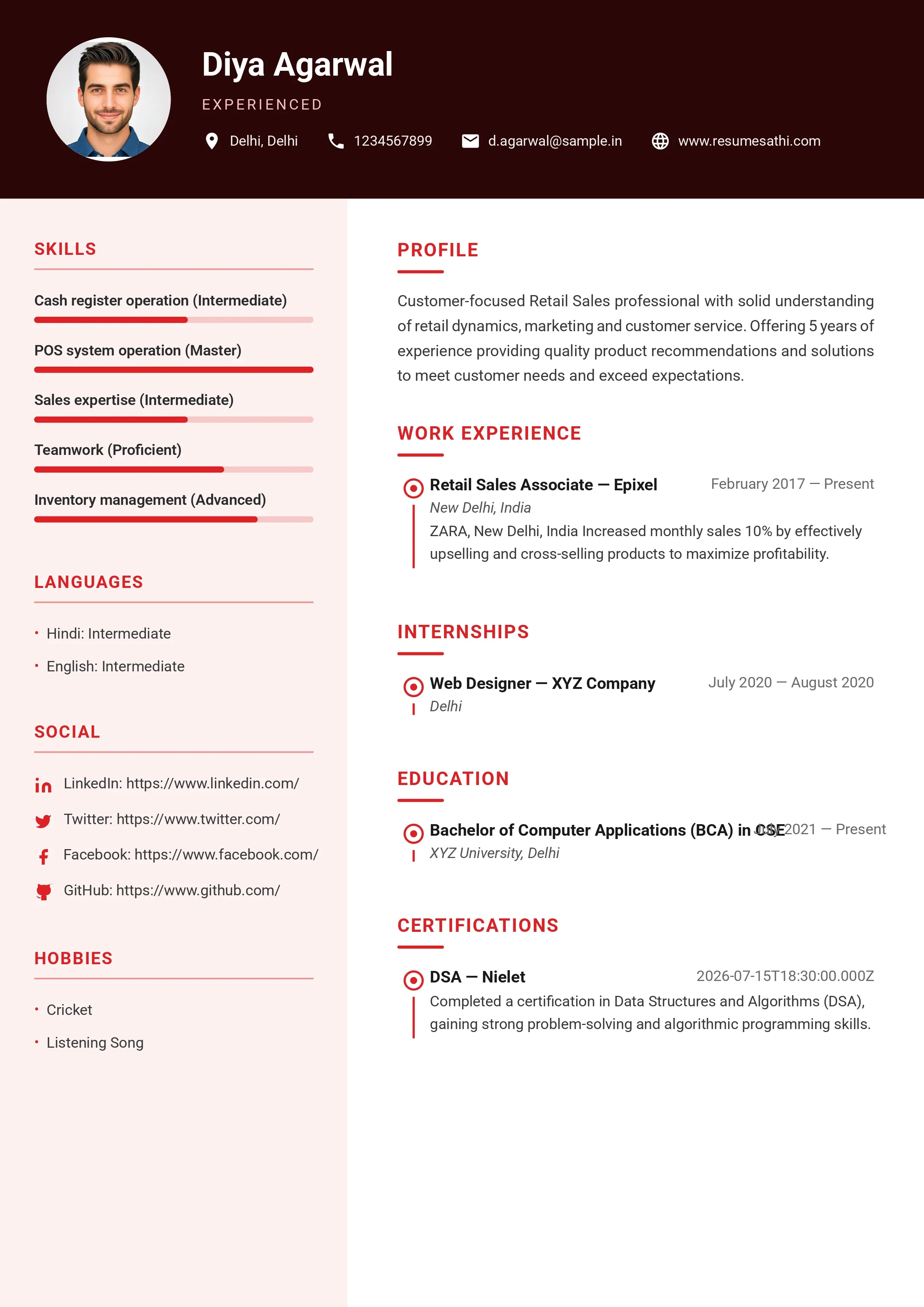
What it looks like. A dark maroon band across the top holds a round photo, the name and the contact details. Under it, the page splits in two. The left sidebar, in a pale pink, carries Skills (with progress bars and the level in brackets), Languages, Social links and Hobbies. The wider right column carries Profile, Work Experience, Internships, Education and Certifications, each entry marked with a small red dot on a vertical line, like a timeline.
Who it suits. People who want a modern, designed look and are happy to include a photo. It fits roles in marketing, sales, hospitality, customer-facing work and creative fields. It is also a decent choice when you are sending the resume directly to a person, by email or on WhatsApp, rather than through a portal.
Watch out for. The progress bars deserve some thought. A bar at 70 percent says nothing a reader can use, and it cannot be copied as text. The brackets after each skill already say the level, so the bars add decoration and little else. The photo is optional in most Indian hiring, and some employers prefer not to see one. If you leave it out, check that the header still looks balanced without it. And as with any dark band, look at a printed or greyscale copy before you send it to a panel.
Tip for filling it in. Keep skill names short, since the sidebar is narrow. Put the longer detail, like tools and certificates, in the main column where it has room.
Template 3: bold red sidebar with a square photo
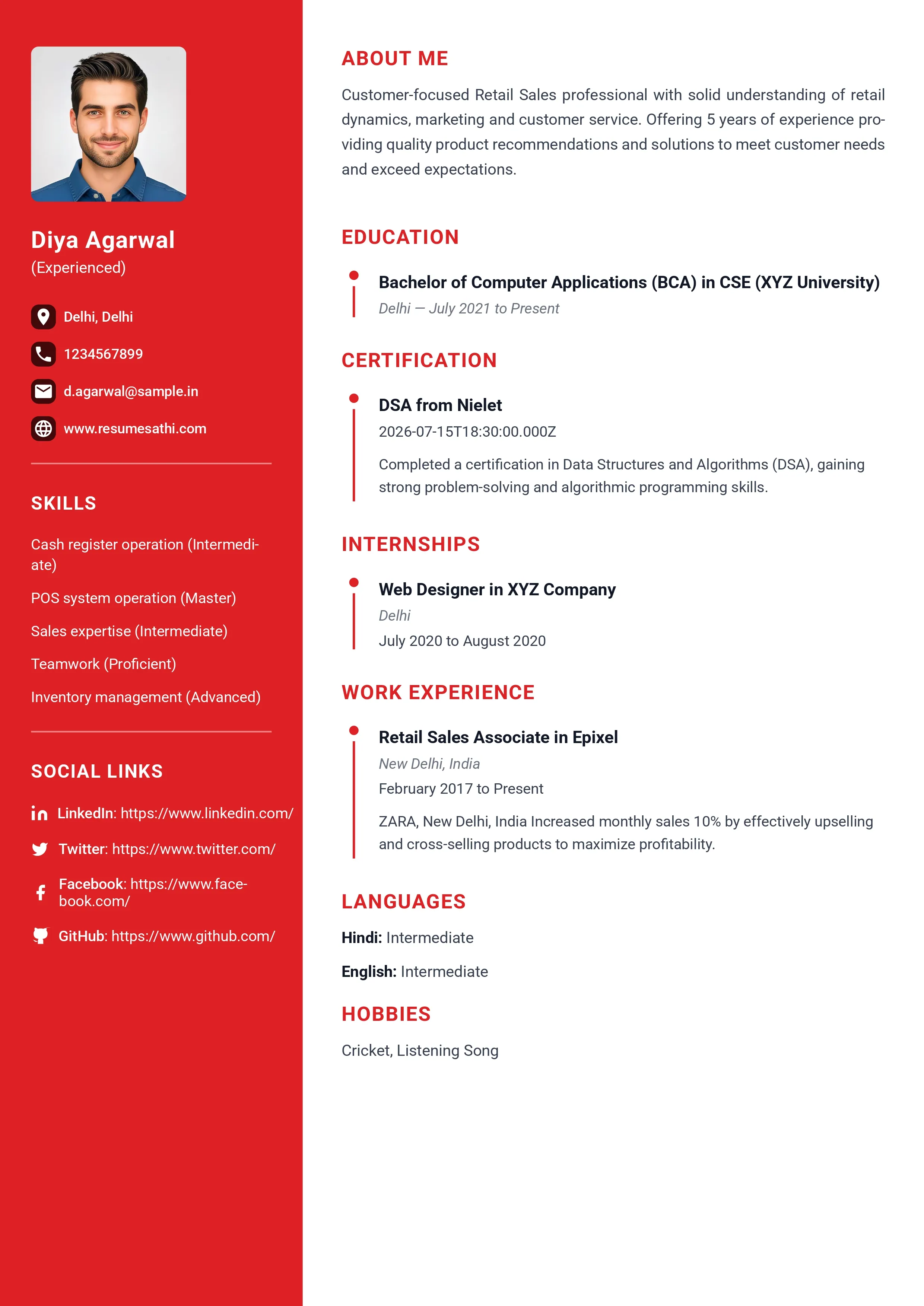
What it looks like. The left third of the page is solid red. It holds a square photo, the name, contact details, skills with their levels, and social links, all in white text. The right two thirds are white and hold About Me, Education, Certification, Internships, Work Experience, Languages and Hobbies. Entries in the main column use a thin red timeline with dots.
Who it suits. It has the strongest visual impact of the eight, so it suits people who want to stand out and are applying in fields where that is welcome. Think design, media, events, sales and similar roles. It is not the template to pick for a bank or a government office.
Watch out for. The solid red block is the main risk. White text on strong red is fine on a screen but can print poorly, and it uses a lot of ink. The sidebar also has to hold the social links in full, and long web addresses wrap awkwardly in a narrow column. Use short profile links, or only add the one or two links that matter, such as LinkedIn and a portfolio. Skip links you do not actively use. A Facebook link on a job application rarely helps you.
Tip for filling it in. The order in the main column starts with Education, which suits freshers. If you have strong work experience, check whether your builder lets you move Work Experience above Education. Experienced people should put their jobs first.
Template 4: classic single column with red rules
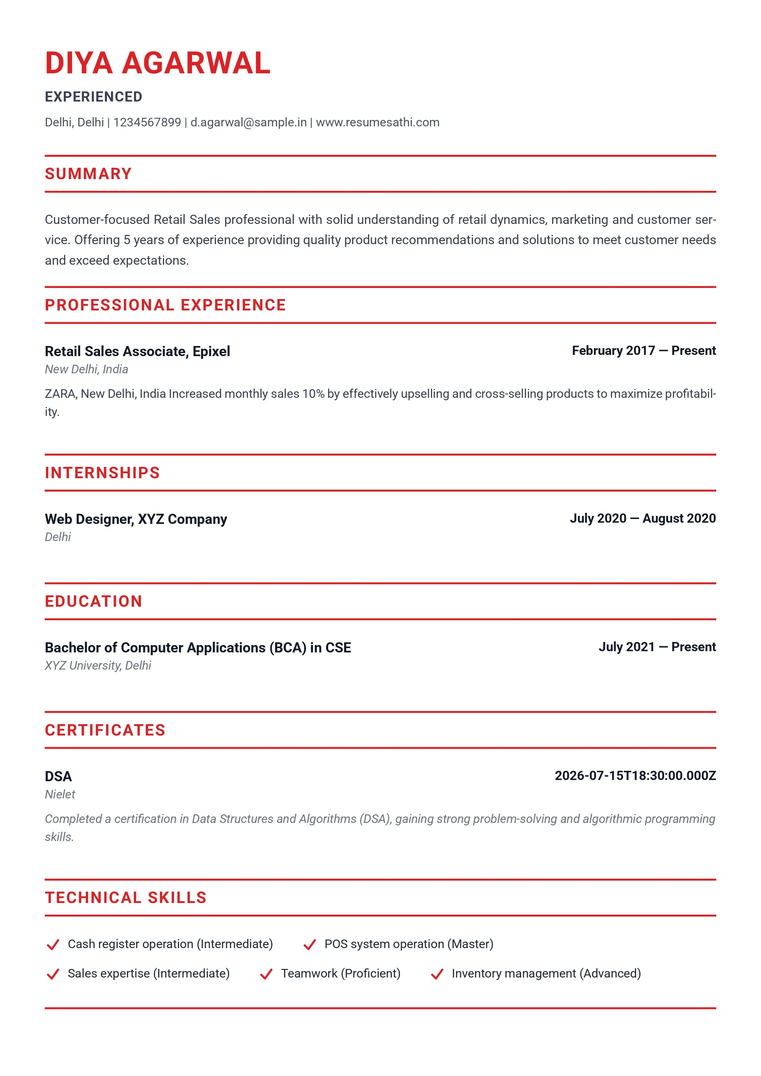
What it looks like. The name is large, red and in capitals, aligned to the left. Contact details run in one line separated by vertical bars. Every section heading sits between two full-width red lines, which makes the page look like a clean form. Sections are Summary, Professional Experience, Internships, Education, Certificates and Technical Skills, and skills have small red check marks in front of them. Dates are aligned to the right edge in bold.
Who it suits. This is the most formal of the eight, and it is the one I would pick for banking, finance, accounting, government, teaching, healthcare administration and any employer that looks conservative. It has no photo and no icons. It is also a strong choice for experienced people, since job descriptions use the full width of the page.
Watch out for. The heading lines take up vertical space. Each section costs you two red rules and some padding, so if you are short of room, drop sections you do not need. The label Technical Skills is another point. It suits technical jobs, but it looks off if your skills are soft skills or tools like billing software and customer handling. If your builder lets you rename the heading, change it to Skills.
Tip for filling it in. Right-aligned dates are what recruiters check first, so make them consistent. Use the same format everywhere, for example Feb 2017 to Present, and not a mix of numbers and month names.
Template 5: dark sidebar for a fresher
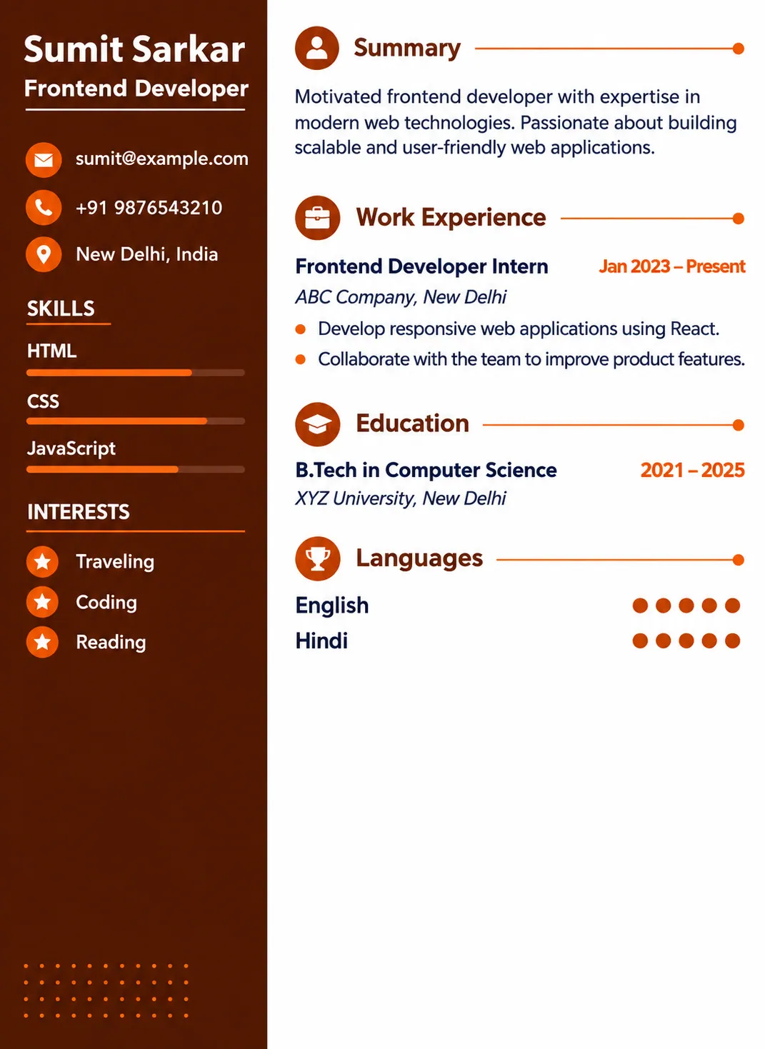
What it looks like. A dark brown sidebar on the left carries the name, role, contact details, a short skills list with thin lines and a small Hobbies block. The right side is white and has Summary, Work Experience, Education and Languages, with small round icons beside each heading. Language skill is shown with filled dots. The sample is a frontend developer with an internship and a computer science degree.
Who it suits. Freshers and people with one short stint of experience. The sections are brief, the page does not need to be full to look balanced, and the layout does not ask for a long job history. Students applying for internships and first jobs can use this and still look organised.
Watch out for. There is not much space for projects, which are what most freshers lean on. If you have two or three projects worth showing, see whether you can add a Projects section, or fold them into the work experience block in the same format as a job. Also keep the hobbies block honest and short. One or two real interests are fine, and a list of six generic ones adds nothing.
Tip for filling it in. Write the summary around the job you want, not around your degree. "Final-year computer science student with two React projects, looking for a frontend internship" gives the reader more than "motivated fresher seeking opportunities".
Template 6: minimal and mostly black and white
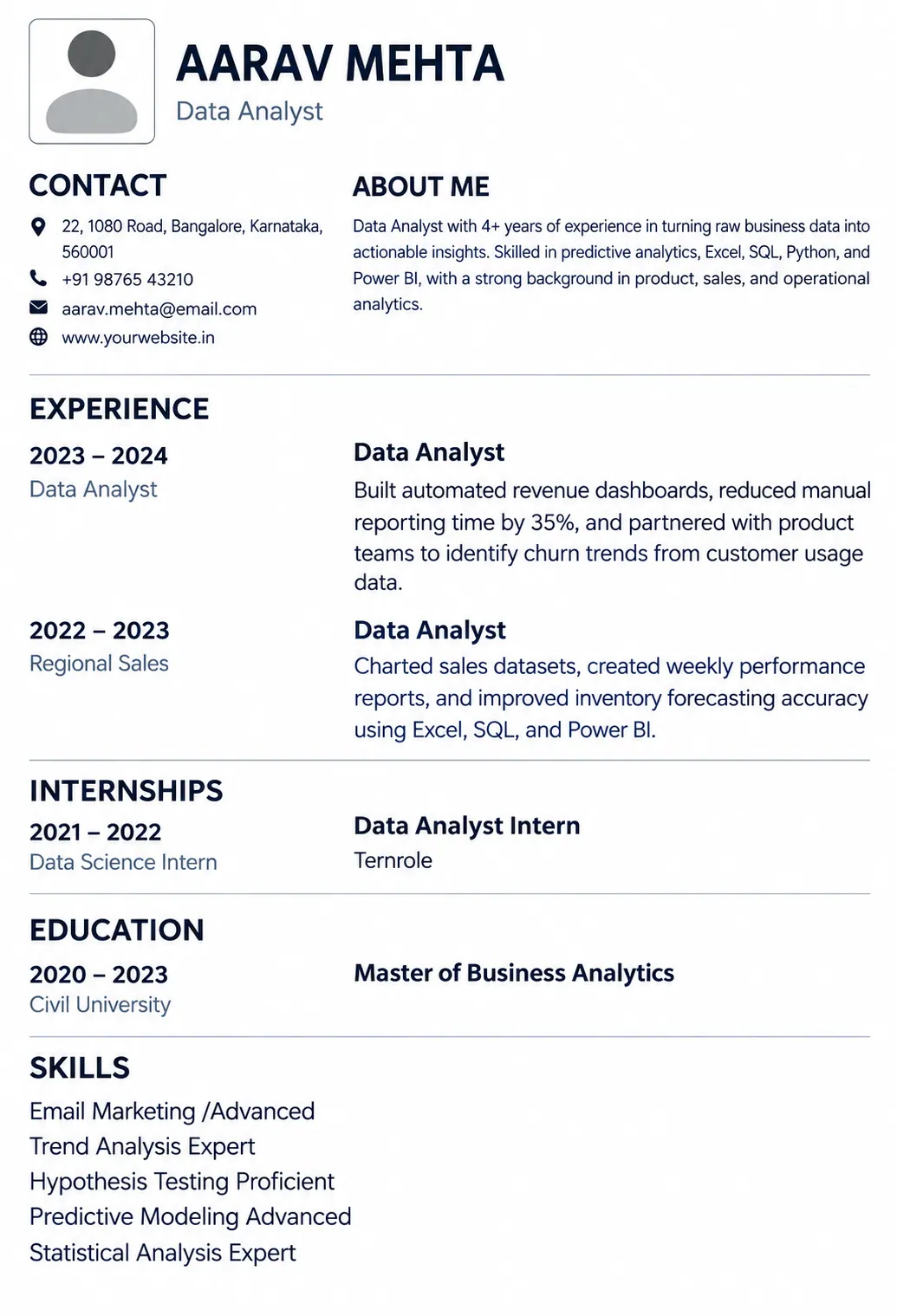
What it looks like. Mostly black text on white with a very light touch of grey. A photo placeholder sits at the top left with the name and role beside it. Below are Contact and About Me side by side, then Experience, Internships, Education and Skills. In the experience part, dates sit in a narrow left column and the job title, company and bullets sit on the right, which makes a long career easy to scan. Skills are plain text lines with the level written after each one.
Who it suits. Experienced people, analysts, consultants, finance and operations roles, and anyone who prefers the content to speak. It prints cleanly in black and white and does not depend on any colour. If you are worried about printing, this is the safest choice of the eight.
Watch out for. The photo box. If you do not want a photo, check that the builder lets you hide it and that the header re-aligns properly. A grey empty box at the top of a resume is worse than no box at all. The plain skills list with levels also needs care. Words like Expert and Advanced are easy to write and hard to defend, so only keep them for skills you could discuss in detail.
Tip for filling it in. The left date column makes it very easy to show career growth. If you moved from analyst to senior analyst in the same company, show both titles under the same company with separate dates, so the promotion is visible at a glance.
Template 7: two columns with a magenta accent
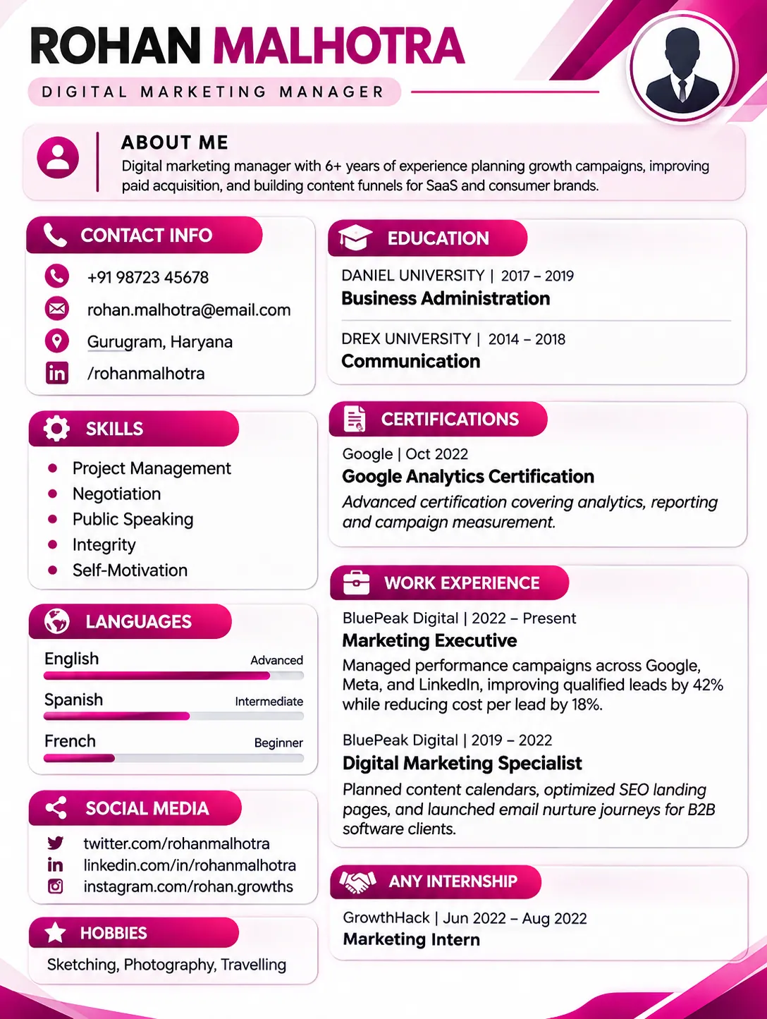
What it looks like. A short About Me block sits at the top. Below it the page splits into a left column and a right column. The left holds Contact Info, Skills as bullets, Languages with small bars, Social Media links and Hobbies. The right holds Education, Certifications, Work Experience and an internship section. Magenta is used for headings and bars only, so the page stays mostly white.
Who it suits. Marketing, content, social media, communications and sales professionals. The Social Media block is useful for people whose online presence is part of the job, because it puts a Twitter, LinkedIn or Instagram link where a reader can find it quickly.
Watch out for. The internship heading reads "Any Internship" in the preview. That is a placeholder style label, so rename it to Internships, or remove the section if you have none. The language bars (Advanced, Intermediate, Beginner) are fine because they carry a label, but do not add a language you cannot hold a short conversation in. Everything in the left column is small, so keep skills to short names.
Tip for filling it in. For marketing roles, numbers matter more than adjectives. Put traffic, leads, conversion or spend figures into your work experience bullets, and keep the left column for tools like Google Analytics, HubSpot and Canva.
Template 8: compact with a green header and tag skills
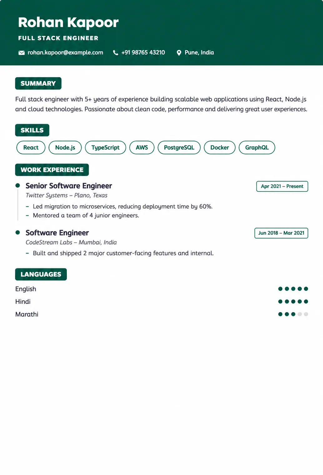
What it looks like. A dark green band holds the name, the job title and a single line of contact details. Below it, a small green label marks the Summary. Skills appear as outlined tags in a row, such as React, Node.js, TypeScript and AWS. Work Experience lists two roles with dates on the right and short bullets under each, and Languages at the bottom use filled dots. The whole page is compact and uses a single column.
Who it suits. Software developers, engineers, data people and anyone whose skills list is a stack of named tools. The tag layout makes the stack visible at a glance, which is exactly what a technical recruiter looks for first. Because it is a single column, it is also a reasonable choice when you are not sure how a portal will read the file.
Watch out for. The compact style pushes you toward very short bullets. That is good for discipline, but do not cut away the result. "Reduced deployment time by 40 percent" is short and still carries the point. "Worked on deployments" is short and carries nothing. Also, group your tags if there are many. Fifteen tags in a row become a wall of words.
Tip for filling it in. Put the tools that appear in the job description first in the tag row. The order tells the reader what you think matters.
All eight at a glance
| Template | Layout | Photo area | Best for | Main thing to watch |
|---|---|---|---|---|
| 1 | Single column, centered header | No | Freshers, portal applications | Skill level tags, empty sections |
| 2 | Header band and sidebar | Yes, round | Marketing, sales, customer-facing roles | Progress bars, dark band when printed |
| 3 | Bold sidebar | Yes, square | Creative and design fields | Heavy red block, long social links |
| 4 | Classic single column | No | Finance, banking, government, experienced people | Space used by heading lines, Technical Skills label |
| 5 | Sidebar, compact | No | Freshers, students, interns | Little room for projects |
| 6 | Minimal, date column | Optional placeholder | Analysts, consultants, long careers | Photo box if you skip the photo |
| 7 | Two columns | No | Marketing, content, communications | Placeholder labels, narrow left column |
| 8 | Compact, tag skills | No | Developers, engineers, data roles | Over-short bullets, too many tags |
Templates and ATS: what is true and what is exaggerated
Few topics in resume advice are as full of half-truths as ATS. Half the internet says a fancy template will get your resume thrown away by a robot, and the other half says that is a myth. Both have some truth in them. Here is a calmer way to look at it.
What an ATS actually does
An applicant tracking system is software that employers use to collect applications. When you upload a resume, the system reads the file, pulls out the text, and tries to sort it into fields: name, phone, email, job titles, companies, dates, education, skills. It stores the result in a database. Recruiters then search that database, filter it, sort it, and open the profiles they want to read.
Two things follow from this. First, the system is only as good as its reading of your file. If it reads your job title as part of your skills list, or misses your phone number, your profile is incomplete, and incomplete profiles are easy to miss in a search. Second, in most setups a human still makes the decision. Some employers add automatic filters, such as questions that end your application when you answer no to a basic requirement. But the idea that a robot looks at your template and says "ugly, rejected" is not how most systems work.
So the real risk of a bad template is not rejection. It is invisibility. Your details are there, but the software stored them wrongly, and the recruiter's search does not find you.
The two-column argument
The most argued question is whether two-column templates cause this problem. If you search for it you will find strong claims in both directions, and it helps to know who is making them.
Several resume-builder companies that sell two-column templates say that modern parsers read them without trouble, and that the worry comes from older systems from the early 2010s. Other companies that sell ATS checking tools say that two columns get read row by row, which mixes the sidebar into the work history. Both groups have a reason to say what they say, and most of the published tests come from one side or the other. There is no neutral, large, public test that settles it for every system.
What can be said fairly is this. Many modern parsers handle columns well when the file is built properly, meaning the text is real selectable text and the reading order inside the file is sensible. Some older or stricter systems, which are more often found in large enterprises and government portals, may not. You usually cannot tell which system an employer uses.
So choose by risk. If you are uploading to a portal at a large employer, or you do not know what the system is, a single column removes the question. If you are sending the resume straight to a person by email or WhatsApp, or the posting says to send a PDF to a named recruiter, a two-column design is fine. And whichever you choose, run the plain text test below on your own exported file. It tells you more about your resume than any general debate.
The plain text test, step by step
This takes two minutes and needs nothing but your computer.
- Export your resume as a PDF from the builder.
- Open the PDF in a browser or PDF reader. Try to select a line of text with your mouse. If you cannot select it, the text is probably an image, and software cannot read it.
- Press Ctrl+A to select all, Ctrl+C to copy, then open Notepad and paste.
- Read what you got. Check that your name and contact details come first, that each job has its own title, company and dates together, and that sections appear in a sensible order.
- Look for missing text, strange symbols in place of icons, and lines that have been glued together.
If the paste looks like a clean, readable version of your resume, you are in good shape. If your skills list lands in the middle of your last job, you have found the sort of problem that confuses software. Try a different template or simplify the one you have.
What causes more trouble than columns
In practice the following cause parsing problems more reliably than a plain two-column layout.
Text inside images. If your resume was made as a picture and saved as a PDF, or if a header was added as an image, software sees pixels and not words. This is common with resumes made in design apps and exported as images.
Text boxes, headers and footers. Some parsers skip the header and footer areas of a document. If your phone number or email lives there, it can vanish. The same goes for text placed in floating boxes in Word.
Icons instead of words. A small phone icon next to a number is fine for a person. For software, a label like Phone or Mobile is clearer. Most good templates add the icon next to real text, which still works. Problems start when the icon is the only clue.
Creative section names. Software looks for familiar headings. Experience, Work Experience, Education, Skills and Certifications are safe. "My Journey" or "What I Bring" are not. If your template uses a quirky heading, rename it where possible.
Tables used for layout. A table full of nested cells is hard to read in order. Builders that make PDFs from clean text are usually fine, but a resume made by pasting content into a complex Word table is risky.
Scanned documents. A photo or scan of a printed resume cannot be read unless the system runs text recognition, and many do not do it well. Always upload the digital file.
Keywords: use them, do not stuff them
Recruiters search by words. If a posting asks for "inventory management" and your resume says "stock control", a search for the first phrase will not find you, even though you do the same work. So when you really have a skill, use the words from the job posting. Copy the tool names exactly: "MS Excel", "Google Analytics", "Tally Prime".
Do not take it further than that. Listing skills you do not have, or pasting a block of keywords in tiny white text at the bottom of the page, is both dishonest and easy to catch. Recruiters notice it, many systems flag it, and it turns into an awkward question at the interview. Keywords should come out of work you have done, written in the words the employer uses.
Where the eight templates stand
Going only by layout, Templates 1, 4, 6 and 8 are single-column designs, so they carry the least layout risk for portal uploads. Templates 2, 3, 5 and 7 use a sidebar or two columns, so they deserve the plain text test before you use them for a portal. This is a comment on layout shape, not a test result. Whether a specific exported file reads cleanly depends on how the builder produces the PDF, and you can only know by checking your own download.
On file format: follow the instructions on the portal. If it asks for a Word file, give it one. If it says nothing, a PDF with selectable text is the normal choice, since it looks the same on every device. Name the file with your name, for example Rahul_Sharma_Resume.pdf.
Fonts, colours, photos, icons and skill bars
Most template builders let you change very little: usually the accent colour, sometimes the font, and in some cases the section order. Even so, these small choices add up. Here is what to do with each.
Fonts and text size
Use the font the template ships with unless you have a reason to change it. Templates are designed around a particular font, and swapping it can break the spacing. If you do get a choice, plain sans-serif fonts such as Arial, Calibri, Roboto or Open Sans are easy to read on screens, and a classic serif like Times New Roman or Georgia is fine for formal fields.
For body text, 10 to 11 points is a good range. Below 10 the page starts to look crowded, and some readers will struggle. Your name can be much larger, around 18 to 24 points, and section headings somewhere between. If you have to go below 10 points to fit everything on one page, the problem is the amount of content and not the font, so cut content.
Colours
One accent colour is enough. It should appear in headings and thin lines, and nowhere else. The rest of the page should be dark grey or black text on white. Avoid light grey text for important details, because it fades on a phone screen and disappears when printed.
Pick the colour with the job in mind. A deep blue, green, maroon or charcoal looks fine almost everywhere. Bright colours like magenta or strong red can work in marketing, design and creative fields, but on a bank resume they stand out in a way you may not want. This is a matter of taste and culture, not a rule, so when you are unsure, go darker and calmer.
Margins and white space
White space is part of the design. A resume with tight margins and no gaps between sections is tiring to read, even if all the content is good. If your template gives you reasonable spacing, leave it alone, and do not shrink margins below about half an inch just to squeeze in more text. A resume that is slightly shorter but easier to read does better than a packed page.
Photos
This is the question people ask most about templates with a photo area, such as Templates 2, 3 and 6. The honest answer is that opinion is divided, and it depends on where you are applying.
In India there is no rule against a photo, and some employers and some job types are used to seeing one. But several of the big Indian career sites and guides advise against adding one unless the employer asks, for reasons that include ATS reading, distraction from your skills, and the risk of bias. Other guides to the Indian format say a photo can add a personal touch. In the US, UK, Canada and Australia, a photo on a resume is generally not expected and is often discouraged, partly because employers there try to avoid anything that could invite bias. Some countries, and some industries such as acting, modelling and certain hospitality roles, do expect one.
A practical way to decide. If the job posting asks for a photo, include one. If it says nothing and the company is large, international or corporate, leave it out. If you are applying to a small local business or a field where a photo is normal, it is a personal choice. When you do include one, it should look like a passport-style photo: clear face, plain light background, simple professional clothes, recent. Never use a cropped group photo, a selfie or a social media picture.
Also remember that a photo area you do not use should disappear. If the template leaves an empty circle or a grey box where the photo should be, pick another template or another layout.
Icons
Small icons next to contact details are harmless and make the header look tidy. Keep them small and consistent. Do not use icons for skills ("a gear for Excel") or as a replacement for words. Their main risk is that they distract, and in some exports they turn into odd characters when text is copied, which you can see in the plain text test.
Skill bars and level labels
Skill bars and ratings, like "Excel 80%" or four stars out of five, are common in templates because they fill space nicely. They are a poor way to say anything. A bar cannot be measured, so nobody knows whether 80 percent means you are good enough to teach it or good enough to open the file. Software cannot read a bar either.
Level labels such as Beginner, Intermediate and Advanced are better than bars because they are words. They still need care. The labels are the first thing an interviewer picks up on. If you write Advanced next to SQL, expect a SQL question. If you cannot answer it, the label has cost you.
A good rule: use a level label only when the level changes how the reader will use the information. For spoken languages, it does. For software skills, a short list of names is usually enough, and the level shows up in the bullet points where you describe what you did with them.
Social and website links
Add only the links that help the application. LinkedIn is useful if the profile is up to date. A portfolio link matters for designers, writers, developers and marketers. GitHub is useful for developers who have projects worth looking at. A link to a social account you rarely use, or one with personal posts, hurts more than it helps. Most templates include Facebook, Twitter and Instagram fields by default, and you do not have to fill them.
If someone prints your resume, a link can only be read as written text, so use a short, clean address. Where the builder allows it, make the link clickable in the PDF too. Test it by clicking it once.
One page or two
Freshers and people with up to seven or eight years of experience should aim for one page. Two pages make sense for long careers or senior roles. A second page that holds only a few lines looks like a mistake, so either fill it or trim until the content fits on one. If your template pushes a single line onto a second page, the fix is usually a shorter summary or one fewer bullet, not a smaller font.
How to fill in any template
Picking the template is the easy half. What goes into it decides whether anyone calls you. This section goes through the parts of a template in the order you will meet them, with examples. The examples use the kind of people shown in the eight templates above: a retail associate, a fresher developer, a data analyst, a marketing manager and a full stack engineer. All names and numbers are invented, so use them only to see the style.
Before you type anything
Open a blank document and write down everything you have done, in plain language, with no worry about length or wording. For each job, list your tasks, the tools you used, the people you worked with, and any numbers you can remember: how many customers, how much sales, how many hours saved, how big the team was. Add courses, certificates, projects and awards.
This messy list is your raw material. When you open the template, you will pick from it instead of staring at an empty box and writing "responsible for". It also turns into your master resume later, which saves you time on every application.
The header
Your name should be the largest thing on the page. Under it most templates show a line for your role or level. In the preview images this line often says something like "Experienced" or "Fresher". Replace that with the job you are aiming for. "Retail Sales Associate" or "Frontend Developer" tells the reader what you are in two words. "Experienced" tells them nothing.
Then add your phone number, email, city and any links you want to include. Use a phone number you answer, and an email made from your name. You only need the city, not the full home address.
The summary
A summary is two or three lines under your header. It answers one question: who is this person and why should I keep reading? A good formula is your role, your years of experience or your stage, one strength, and what you want next. Here are three examples for different situations.
Fresher: Final-year B.Tech student in computer science. Built two React projects and finished a three-month frontend internship. Looking for a junior frontend developer role.
Experienced: Retail sales associate with five years in fashion stores. Handle billing, stock counts and customer complaints, and trained three new joiners. Looking to move into a store supervisor role.
Career changer: Operations executive with four years in logistics, now moving into data analysis. Completed SQL and Power BI courses and built a delivery-time dashboard from real company data.
Notice what they do not contain. There are no words like "passionate", "hardworking" or "results-driven". Those words are on thousands of resumes, and a reader learns nothing from them. Facts do the work: what you built, how long you did it, what you handled.
Write the summary last. It is much easier once the rest of the resume exists, because you can see what your strongest points actually are.
Work experience
This is the section most people struggle with. Under each job, write three to five bullet points. Each one should say what you did, and where possible, what came out of it.
A simple structure that works: start with a verb, say what you did and how, then add the result. "Handled" or "managed" are fine verbs. "Cut", "raised", "built", "trained" and "reduced" are better because they point at a change. Try not to start four bullets in a row with the same verb.
| Role | Weak bullet | Stronger bullet (example numbers) |
|---|---|---|
| Retail sales associate | Responsible for customer service | Handled 40 to 50 customers a day on weekends, and resolved most complaints at the counter without escalation |
| Frontend intern | Worked on website pages | Built six responsive pages in React and fixed layout bugs found during testing on mobile screens |
| Data analyst | Made weekly reports | Automated the weekly sales report in Excel and SQL, saving about four hours of manual work each week |
| Digital marketing manager | Ran social media campaigns | Ran paid campaigns on Meta and Google with a monthly budget of around Rs. 2 lakh, and improved the lead cost over two quarters |
| Full stack engineer | Developed backend services | Moved a billing service to separate microservices and cut deployment time from 40 minutes to about 15 |
In each pair, the weak bullet describes a duty and the stronger one describes something that happened. You do not need a number in every bullet, since forced numbers look odd. But when a real number exists, find it. If you do not remember the exact figure, give an honest estimate and write "around" or "about". Never invent a figure, because the interviewer will ask how you worked it out.
Order matters too. Put the bullet that best matches the job you want first. Readers give the most attention to the first line of each job and less to the rest.
If you are applying for a job in a new field, rewrite old bullets in terms of what carries over. A shop supervisor who wants an operations role can emphasise stock control, scheduling and handling a team. The facts stay the same. You just choose which ones to show.
Internships and projects
If you have little or no job history, internships and projects are your main material. Treat them like jobs: name, organisation or context, dates, and two or three bullets. Say what the project was for, what you did yourself, and what tools you used.
For group projects, be clear about your part. "Built the login and payment pages of a team project in React and Firebase" is stronger and more honest than "developed an e-commerce website". If a project is online, add a link. A working link is worth a paragraph of description.
Keep to the best two to four items. Five average projects look worse than two good ones.
Skills
List only skills you could talk about for a couple of minutes. Put the ones the job asks for first. If the template shows skills as tags, make sure the first few are the most relevant, since readers look at the start of a row.
If you have a long list, group it. Instead of 18 words in a row, use short headings: Languages, Tools, Databases. If you do not have many technical skills, add working skills that are specific, like "cash handling", "POS billing" or "inventory counts". These are more useful to a retail employer than "good communication".
Be careful with levels, as discussed earlier. If your template asks for a level next to each skill, fill it in only where it helps, and be ready to be tested on whatever you claim.
Education
Write the degree, the college or university, and the years. Add your marks or CGPA if they are strong or if the employer asks. For freshers, education goes near the top, and you can add relevant subjects, a final-year project or academic achievements. For people with several years of experience, it drops lower and shrinks to one line per qualification.
If you are still studying, write the expected year of completion, for example "Expected 2027". Do not write "Present" and leave the end date open if the program has a clear end.
Certifications
List the name of the course, the organisation that issued it, and the date or year. Include only those related to the job. A certificate in Data Structures and Algorithms helps a developer application and does very little for a retail one.
After you fill in dates, look at the preview. Make sure every date shows in a normal readable form like "July 2025" and not a string of numbers and letters. If a date looks strange, retype it in the format the builder expects.
Languages, hobbies and extras
Languages are useful in many roles, especially customer-facing ones. List the languages you can actually work in, and label the level plainly: Fluent, Conversational, Basic.
Hobbies are optional. If you have the space, one or two real interests can give a reader something to talk about at the interview. If space is tight, hobbies are the first thing to cut. Avoid generic items like "listening to music" or "travelling", which tell the reader nothing about you. "Plays cricket for a local club" or "writes a small blog about budget travel" are specific.
Extras like volunteering, competitions and clubs work best when they show something relevant: leadership, teamwork or a skill. Include them if they do, and leave them out if they are just filler.
Section order
Section order should follow your strongest material. A rough guide:
| Your situation | Order that usually works |
|---|---|
| Fresher | Summary, Education, Projects, Internships, Skills, Certifications |
| A few years of experience | Summary, Work Experience, Skills, Education, Certifications |
| Long career | Summary, Work Experience, Education, Skills, Certifications |
| Career changer | Summary, Skills, Projects or courses, Work Experience, Education |
If your template locks the order, as some do, choose one whose built-in order suits your situation instead of forcing your content into the wrong shape. A fresher using a template that leads with Work Experience will end up with a thin first section and a weak first impression.
What to cut when the page is full
One page is a good target, and sooner or later you will have to cut. Go in this order. Remove hobbies. Remove old, unrelated jobs, or shrink them to a single line. Shorten bullets on older roles. Drop weaker projects. Cut skills you could not discuss. Only after that should you consider smaller margins, and never go below 10 point text.
A page that looks a little empty is fine. A page that looks crammed gets skimmed and ignored.
The final read-through
When everything is filled in, read the preview from the top as if you were a stranger. Do you know within five seconds what job you want and what you have done? Are all dates in the same format? Is every section filled, and is every heading meaningful? Then read it aloud once. You will catch missing words and awkward sentences that your eyes skipped. Finally, check the phone number and email letter by letter.
One template, many jobs
People often think they need a new resume for every job. You do not need a new one from scratch, but you do need to adjust it. The easiest way is to keep a master resume and make a short, targeted copy each time.
Keep a master version
Your master resume is the long version with everything in it: every job, every project, every bullet, every certificate, even if it runs to three or four pages. It is not for sending. It is a place to store your material. When a job comes up, you copy the most relevant parts into the template and cut the rest.
The ten-minute tailoring routine
For each application, do these five things.
- Read the job posting and underline the skills and tasks it mentions most often.
- Check that those things appear near the top of your resume, in your summary, your first bullets and your skills section.
- Reorder the bullets under each job so the most relevant ones come first.
- Swap in the posting's wording for skills you really have. If it says "customer relationship management" and you wrote "CRM", write it both ways once.
- Re-export the PDF and name it clearly, for example Rahul_Sharma_Resume_Marketing.pdf.
That is all. It is a small effort that makes your resume look written for the role, and it tends to matter more than which template you use.
Keep a simple record
Make a small list of where you applied, which version you sent and when. It helps when a recruiter calls and you need to remember which role and which resume it was. It also shows you, after a few weeks, which version gets responses and which does not.
Update it regularly
Add new achievements when they happen, not when you start job hunting. Notes written the same week are accurate and detailed. Notes written two years later are vague. Put a reminder in your calendar every three or four months to spend ten minutes on your master resume.
Template mistakes people keep making
These come up again and again, and almost all of them are easy to fix once you know to look for them.
Choosing by looks alone. The best-looking preview is not always the best fit. A template built for a long career can make a fresher look empty, and a template built for freshers can squeeze a ten-year career into nothing. Match the template to the content you actually have.
Leaving sample text behind. It sounds unlikely, but placeholder wording, sample company names and unchanged section labels do end up in finished resumes. Read every line once and make sure no leftover text remains, including small things like a heading that says "Any Internship" when you have none.
Keeping empty sections. A heading with nothing under it looks unfinished. If you have no internships, no certifications or no hobbies to show, remove the section. A shorter, complete resume reads better than a long one with gaps.
Using a photo you would not want a recruiter to see. Poor lighting, a cropped group picture, sunglasses, a filter or a selfie in a mirror makes a resume look careless. If you cannot take a proper photo, skip it, since the photo is optional in most cases.
Overusing level labels and bars. Rating yourself on ten skills makes it look like you have no strong ones. Choose a handful, and let the bullet points prove them.
Stuffing too much into a narrow sidebar. Sidebars are for short items. When you put full sentences or long lists into one, the text wraps badly and the whole page looks cramped. Move long content to the main column.
Keeping the template's section order when it does not suit you. If the template shows Education first and you have eight years of experience, move your work history up where possible, or choose another layout. The first screen of your resume should show your strongest material.
Never checking the exported file. The preview in the builder and the PDF you download can differ. Open the actual PDF, check that nothing is cut off and nothing spills, and run the plain text test. Many people do this only after sending the resume to ten employers.
Mixing styles. Using two accent colours, three different date formats, or a mix of full stops and no full stops in your bullets makes the page look sloppy. Choose one way and keep to it.
Sending the same file to every job. Even a small change to the summary and the first few bullets helps. The template can stay the same.
Checklist before you download
- The template suits my situation (fresher, experienced, career change)
- The label under my name is the job I want, not "Experienced" or "Fresher"
- No sample text, placeholder headings or empty sections remain
- Summary is two or three lines and says what I do
- Each job has bullets that show a result where possible
- Skills match the job posting and I can discuss every one of them
- Dates are in one format and display properly in the preview
- Photo is a proper passport-style photo, or I have removed the photo area
- Links are short and work when clicked
- The PDF has selectable text and the plain text test came out clean
- Text is 10 points or larger and the resume fits on one page (or two with good reason)
- I have read it out loud and checked phone and email carefully
- The file is named with my name
Frequently asked questions
Which resume template is best for freshers?
A clean single-column template or a simple sidebar design that puts education, projects and internships near the top. Templates 1 and 5 above are built with this in mind. The layout matters less than the content. A fresher resume with two real projects and a clear summary beats a fancier one with vague bullet points.
Which resume template is best for experienced people?
One with a wide text area and clear dates, such as Template 4 or Template 6, so that longer job descriptions stay readable. Put work experience first, and keep older jobs brief.
Are free resume templates good enough?
Yes, if the layout is clean and the exported file is readable. A free template that reads well in plain text and looks tidy does the same job as a paid one. What you pay for in paid templates is mostly styling. Content, not price, decides how well a resume works.
Is a two-column resume template ATS friendly?
It depends on the template and the system reading it. Many modern systems read well-built two-column files correctly, while some older or stricter ones may not. If you are unsure, use a single-column template for portal uploads, and test your own PDF with the plain text method described above.
Should I add a photo to my resume in India?
Only if the job asks for one, or if you are applying in a field where it is normal. Many career guides in India suggest leaving it out otherwise. If you include one, use a clear passport-style photo with a plain background.
Should my resume be one page or two?
One page for freshers and for most people with up to seven or eight years of experience. Two pages for long careers or senior roles. Do not let a second page carry just a few lines.
PDF or Word?
Follow the employer's instructions. If none are given, send a PDF, because it looks the same on every device. Make sure the text in the PDF can be selected.
Can I use the same template for different jobs?
Yes. Keep the template and change the content: the summary, the order of bullets and the skills list. If you are moving between very different fields, such as banking and design, a different template may also help.
Are skill bars and percentage ratings a good idea?
Not really. They cannot be measured, and software cannot read them. Use short level words like Fluent or Intermediate only where they help, such as for languages, and show your skills through bullet points instead.
What font and font size should I use?
A plain font like Arial, Calibri, Roboto or Open Sans for body text, at 10 to 11 points. Your name can be 18 to 24 points. If the template sets its own font, it is usually best to leave it.
How do I choose a colour for my resume?
Use one accent colour for headings and lines. Deep blue, green, maroon and charcoal suit almost any job. Brighter colours are fine in creative fields. Always check that the text is readable in black and white.
Do recruiters care which template I use?
Not in the way people fear. Recruiters care that the resume is easy to scan and that the information is clear and accurate. A tidy template helps with that, but no recruiter picks a candidate because of a particular design.
Can I use Word or Canva templates instead of a resume builder?
You can, as long as you check the exported file. Some templates made in design tools use text boxes, images and unusual layouts, which can cause problems when software reads them. Run the plain text test on whatever you use.
What if my resume goes a few lines onto a second page?
Trim instead of shrinking the font. Shorten the summary, cut a weaker bullet, remove hobbies, or merge two short sections. If that is not enough, check whether an older job can shrink to a single line.
Is it okay to leave sections empty?
No. Delete sections you do not need. An empty heading looks unfinished, and it also wastes space on the page.
How often should I update my resume?
Add achievements when they happen, and review the whole thing every three or four months, even when you are not looking for a job. It saves a lot of effort when an opening appears suddenly.
Final words
A template should disappear. When a recruiter opens your resume, the first thing they should notice is what you have done, and the layout should simply make that easy to find. If you remember only a few things from this guide, remember these. Match the template to your situation. Check the exported file, not just the preview. Keep the layout simple when you are unsure. And spend your real effort on the words inside it.
If you want to try the templates shown in this post, you can find them on ResumeSathi. You can fill one in with your own details, look at the preview, and download the PDF. Then run the plain text test on your download before you send it anywhere. Two minutes of checking will tell you more than any list of tips.


Comments
No comments yet. Be the first to comment.