
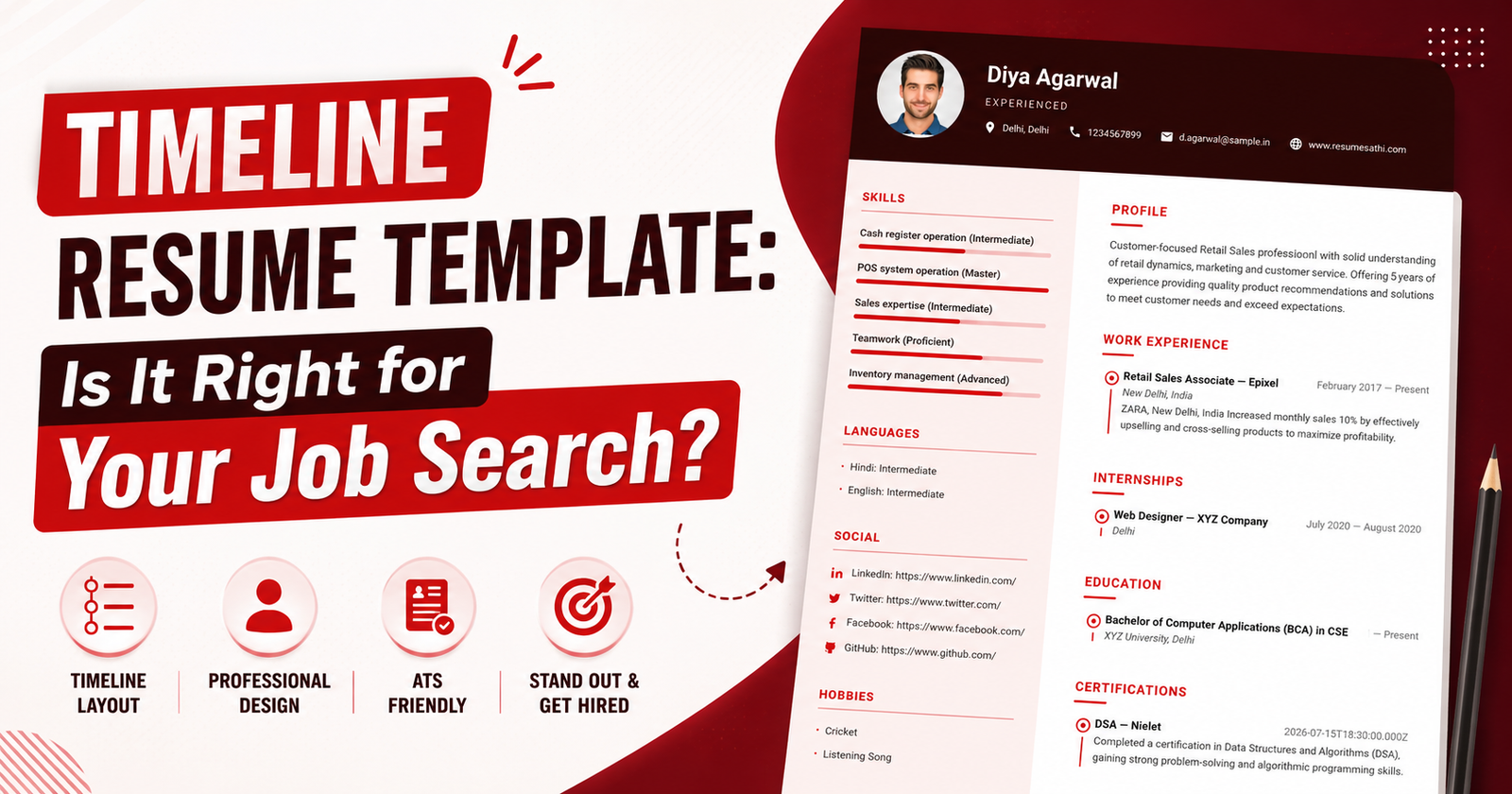
I get asked this a lot — "which resume template should I actually use?" And honestly, there's no single right answer. It depends on what job you're going for, how much you want to show off visually, and whether the company you're applying to even bothers reading past the ATS screening. One template that a lot of people gravitate toward lately has a dark header, a round profile photo up top, skill bars running down the side, and a two-column body underneath it. That's the one I want to talk about here.
If you've seen it before and wondered whether it's worth using, or you're just trying to figure out if it fits your field, this should clear things up.
Breaking Down the Layout
The template is really just two zones stitched together. Nothing fancy, but it's laid out in a way that makes sense once you see it in front of you.
| Section | Where It Sits | What Goes In It |
|---|---|---|
| Header | Full-width, top | Name, designation, location, phone, email, website |
| Left Sidebar | Left column | Skills with progress bars, Languages, Social Links, Hobbies |
| Main Content | Right column | Profile Summary, Work Experience, Internships, Education, Certifications |
What I like about this setup is that it gives you room to include the extra stuff — languages, hobbies, social links — without it feeling like you're cramming things into a corner just to fit them in.
What Actually Sets It Apart
A few small design choices make this template stand out from the usual plain-text resume:
- Skill bars next to each listed skill — instead of just naming a skill, you can show roughly how good you are at it (Intermediate, Proficient, Advanced, that sort of thing)
- A dotted timeline running through Work Experience, Internships, and Certifications, so it reads a bit like a story instead of a list
- One accent color used consistently across headers and icons — small detail, but it makes the resume look put-together rather than thrown together
- A proper spot for social links, which honestly gets left out of a lot of templates even though recruiters do check LinkedIn and GitHub
Who Should Actually Go For This One
Not every template works for every job, and this one's no exception. Some fields respond well to a bit of visual flair, others really don't.
| Candidate Type | Good Fit? | Why |
|---|---|---|
| Retail / Sales Professionals | Yes | The skill bars make your strengths easy to scan at a glance |
| Freshers / Students | Yes | Internships and education actually get proper visibility instead of being buried |
| Designers / Creative Roles | Yes | The layout itself doubles as a small demonstration of design sense |
| Corporate / Finance Roles | Not really | These industries usually expect something more conservative and text-heavy |
| Senior Management Roles | Not really | Timeline-style templates tend to read as junior to mid-level |
Now, About ATS — Will It Even Get Read?
This is the part people worry about most, and fair enough. A resume can look great and still get chewed up by an applicant tracking system if it's not built carefully.
| Element | ATS-Safe? | Note |
|---|---|---|
| Two-column layout | Mostly | Older ATS software can occasionally scramble the reading order |
| Skill progress bars | Somewhat risky | Type out the actual skill level in words too, don't rely on the bar alone |
| Icons for contact info | Usually fine | Just make sure the text sits right next to the icon, not inside it |
| Profile photo | Depends | Normal practice in India, but some international recruiters prefer no photo at all |
If the company you're applying to is a large corporate setup, it doesn't hurt to keep a plainer, single-column resume on standby too. Better safe than filtered out before a human even looks at it.
A Few Things Worth Doing (and Avoiding)
Some of this is common sense, but it's easy to overlook once you're deep in template customization mode:
- Keep the skills section tight — only what's actually relevant to the role you're applying for
- Add real numbers to your work experience wherever you can, even something like "grew monthly sales by 10%" changes how a line reads
- Stick to professional social links only, this isn't the place for a personal Instagram
- Don't try to fit every section you can think of, a resume with too much going on stops being readable
- Don't guess at your skill bar levels just to look good, recruiters notice inconsistency between what you claim and how you answer in an interview
- Keep certification and work dates in one consistent format throughout
Timeline Template vs a Plain One — Side by Side
| Factor | Timeline Template | Simple/Minimal Template |
|---|---|---|
| Visual Appeal | High | Lower |
| ATS Safety | Medium | High |
| Best For | Retail, creative, entry-level roles | Corporate, government, traditional industries |
| Customization Options | High — colors, bars, icons | Limited |
| Recruiter Scan Time | Fast, guided by visuals | Fast, but plainer |
Where I'd Land On This
If you're in retail, sales, design, or you're a fresher still building out your work history, this template genuinely does a good job of making a thin resume look complete and a strong one look even better. But if you're eyeing a corporate or finance role, or applying somewhere known for being conservative about hiring formats, I'd lean toward something simpler instead.
At the end of the day, the best template isn't the one that looks the most polished on screen — it's the one that gets your actual experience across clearly, without getting in its own way.
Building your resume with templates like this one? Check out the other resume-related posts on the channel for more guidance.

Comments
No comments yet. Be the first to comment.